 Those red and blue maps we’re seeing everywhere are too depressing in their picture of an utterly polarized country–and of course, the reason for that is that they’re too simplistic. Over at boingboing, a reader, Jeff Culver, thought about this and made a more nuanced (and accurate) picture.
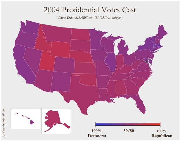
He says:
I was thinking today about how the ‘red v. blue’ states graphic is really misleading considering the slim margins that the candidates won some of those states by, so I sat down and created the map that’s attached. In the dozens of hours I’ve been watching the news I haven’t seen one like it, but thought that you and the BoingBoing readers might find it interesting. I think it definitely portrays our fellow states far differently than the extreme way we’ve been seeing to date.
Actually, the boingboing post also led me to USAToday’s map broken down county by county. The correlation between urban/rural and Kerry/Bush is quite fascinating. What’s more, you can choose to see actual numbers for each county. In New York State, Manhattan has by far the widest spread between Bush and Kerry voters. I’m a real sucker for numbers and “visual display of quantitative information,” as Edward Tufte would put it!
Ooh, even more fascinating map stuff (cartograms which make population density visible) from UMich (via Salon).