Mountebank Blog

"There is nothing so impossible in nature, but mountebanks will undertake; nothing so incredible, but they will affirm."

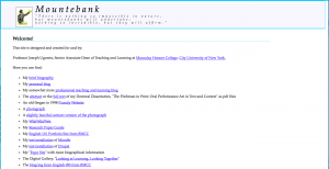
Redesigned

For a very long time (since March 2004) my homepage here at mountebank.org has had the same look.  It was clear, and readable, I always thought, and really just a list of links.  But it certainly didn’t look too modern.  Didn’t really represent very well what I’ve been doing with WordPress lately.  The blog was using the first WordPress theme I ever built, and simple as it was, it worked.  So, with some time off and a cold day (really a couple of days), I took the chance to do some redesigning.  The homepage is now more like a “calling card” with far less on it (although I think I will put a bit more as time goes by).

And the blog is still the same old blog (it was fun to look through some old content).  I still won’t update it very frequently, probably, but from time to time I’m glad to have it as a medium.  And I learned a lot as always in the redesign (also moved to a new host and cloud server).  My CSS skills are improving.  And my MySQL skills less so.  My overall command line comfort is unjustifiably secure.  And in WordPress…I pretty much know what I’m doing.

On Being a Wizard

There are many things to like about Gandalf, but one of the best is that he is a wizard not because he is some kind of magical creature, not because some other wizard bit him, but because he learned to be a wizard. When he has a serious question, what does he do? He goes to the library!

(First animated gif I made from “scratch,” too).

library

Blog From iphone

parachute jump at Coney IslandTo post directly from the iPhone, and even with a picture. How nice!

Sync iCal Outlook Entourage iPhone Google Calendar

This was (for me) the holy grail of syncing. I wanted all the possible syncing to work in all the possible directions–so if I added an event (or changed or deleted one) on the calendar on my iPhone, it would be reflected on the other calendars, too–and vice versa and versa vice. On Mac and on PC. (probably not necessary to explain why this complicated syncing was necessary–but I know, from much googling, that others would like to be able to do it, too.)

At first it was looking like it really would not be possible. But then two new developments made it all work.

IPhone 2.0 included true Exchange integration, and Google Calendar released their Calendar Sync (PC only, damn it, but that was workable).

So here’s how it all works now…

On the iPhone, set up to sync mail, calendar, and contacts with Exchange. That’s easy one-step, and syncs almost instantly.

Then the Exchange server handles syncing all that info with Entourage (on Mac) and Outlook (on PC).

The Google Calendar Sync handles syncing Outlook with Google Calendar (I keep that running in a VMWare Fusion virtual Windows XP machine on a desktop Mac).

And Spanning Sync (on the Mac) handles the syncing between Google Calendar and iCal.

Believe it or not, the whole thing works. There is (at most) a 10-minute lag for any event to sync, but they all do reflect all the same changes, and the best part is that it works for the iPhone without connecting the cable to sync.

Of course, an open calendaring standard, shared by everyone, would make all these gymnastics unnecessary. But as long as there’s Microsoft Exchange around, I don’t hold out much hope for that actually coming.

Macaulay Eportfolios

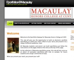
eporfolio site screenshotIt took me longer than I wanted, but I finally managed to get the Macaulay Eportfolio site up and running. I’m very pleased with the initial installation–this is using WordPress Multi-User as an eportfolio platform, something that more and more people are starting to do. It was a long process to decide what would be best for Macaulay students–and I know there are many possible solutions to this kind of question. But WPMU offered several advantages for our needs. After some email exchanges and a visit with Jim Groom, I felt that the advantages really made it worth a try.

Those advantages, in brief:

  • Free and open source. It’s always good to conserve resources, and it didn’t sit well with me to shell out many thousands for a product that we might not stay with for very long, and that would then, by virtue of the money we spent, also own us–or at least hold a lien.
  • Easy to use and maintain with a small staff–and no full-time programmers. WordPress has a huge and helpful community, and I and the Tech Fellows have extensive experience with using it, changing it, fixing it, and extending it.
  • Easily customized (templates) look and feel. WordPress has so many themes, with such a variety of looks. Most of the “regular” eportfolio systems go too far in one direction or another. Either they’re completely standardized with at most a little color change to express individuality, or they’re wide open and thus very difficult for students to navigate the process of customizing their appearance. WordPress themes, which give a range of different attractive options, easily switched or re-switched, or even altered (or created from scratch) by more advanced students, seemed like a perfect compromise
  • A cabinet of curiosities/museum. This was kind of the controlling metaphor I wanted for the eportfolios, and WordPress really lends itself to that. For a while I was stuck on the repository idea (the box in the basement metaphor). I was really considering that the eportfolio system had to be a full-service system, with the area for “dumping” all the artifacts or content integrated with the system for reflecting on and presenting that content. But Jim Groom (in one of those should-have-been-obvious brilliant recommendations) unstuck me from that. The repositories are out there, easily available, and it’s just not necessary (or even really advisable) for me to focus on providing them. With YouTube, flickr, Google Docs, voicethread, odeo, etc., why bother to focus so much on providing that “box”? As a cabinet of curiosities, or as a museum, it’s possible to just pull all the content and rearrange it, to walk around or to sit with it, to show it to others in a guided tour, or to have private rooms, or members-only displays. The metaphor’s not perfect, but it got me moving in the right direction, and I integrated it into the site description.
  • Easy to organize and reorganize. This one may need a little work with WordPress, but the idea is that the categories become the organizing tool. Like tagging, the categories can be post-facto, rather than predetermined, and there can be multiple (or adjustable) categories for any item. That’s key I want integrative learning–seeing relationships between and among different learning activities, to be built-in to the eportfolio.
  • Reflection and interaction central. Once the repository is separate from the system, the posts become reflection and consideration…and even better, they also provide the interactive element through comments. If an eportfolio lives and grows, and encourages collaboration and development…well, that’s what it’s there for. And rare.

Those are the basics (apart from the ones I’m forgetting), and it remains to be seen how it all works out when (probably in the fall) students really start using the system.

One of the best things we have here at Macaulay is the Tech Fellows–so however it all begins to roll out, I’ve got them for support, and ideas, and development, too.

More updates as this develops!

Testing Lightbox and Iimage Browser Together

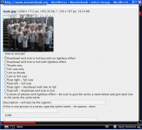
the iimage browser window with the options I addedSo this is a fun thing–I took the Lightbox 2 script and married it to Iimage Browser. Lightbox has the effect that anyone can see (check the images below). It takes a thumbnail linked to a full-size image, and instead of just having that full-size image open up normally, it gives it a cool overlay effect–this page darkens, and the new image opens above it, sort of laid on top. Even better, if there’s a series of images, it gives the number of them, and “next” and “links” that appear when you mouse over the image. That’s fun, but it wasn’t quite elegant or user-friendly enough. On this blog I use the Iimage Browser plugin on the back-end (you can’t see that as a reader) to easily upload images and add them to posts. I had already hacked Iimage Browser a bit, to add options to “float” the images on the right or left of a post (wrap the text around them). So for this, I hacked it again, to add the lightbox function for any thumbnail, and to give a simple text box choice, no coding necessary, to also use the Lightbox series effect easily. If I get time (and remember what I did), I should probably wrap it up and pack it up with nice instructions, too. It’s not really a big modification to either the script of the plugin–and if I were even better about this (and had more time)–I would really put it all together into a plugin that would do everything. But for now, it was a stretch of my abilities, and I’m impressed with myself that I made it work!

Here’s an example with just one single picture (without wrapped text–not floating)this is my caption
So that was one picture–now I would like to have a series of pictures all together and be able to navigate next or previous. so I’ll put them here
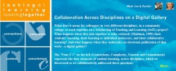
this is the cuny bannerdportfolio pagethe online ad

WordPress as a CMS

Well, I’m here to tell you it can definitely be done. I’m not the first to discover this, of course, but I really was surprised to see just how well, and how easily, it works. My favorite art historian wanted (with her colleague) to turn all the content they had developed (“lectures” from online courses, podcasts, YouTube videos, flickr images, great sites and web resources) into a kind of free, multimedia, online textbook for art history.

Their experience was that most of the art history textbooks for undergraduates were just, well, wrong. They were pitched to a level that didn’t match, they weren’t engaging in either style or content, and they managed to turn the exciting social history part of art history into just more dull-as-dishwater, decontextualized, blahblah.

(A perfect example of this–today I was in the Art department at my college, and I saw a copy of Gardner’s Art Through the Ages–one of the major textbooks in the discipline, being used extremely effectively, extremely practically….It was used as a booster to lift a computer monitor up to eye level. Probably would make an excellent doorstop or paperweight, too.)

Even the textbook publishers who did have websites connected to their texts seemed to just reproduce the text–nothing towards making them more engaging–and in any case, those sites were closed–available only to people who bought (for more than a few dollars) the print textbooks or some kind of access key.

So they wanted to do something different in style, something open, something making good use of multimedia, something searchable and visually attractive…and they didn’t want to have to learn a whole lot of html, flash, css, and everything else. And they wanted to be able to collaboratively add to and edit the site.

WordPress to the rescue! With a theme they liked, wordpress’ built-in pages and custom fields, and a few expedient plugins (and the help of their friendly neighborhood geek guy–me), over one long weekend they got a very good start, which can easily be continued and expanded, at creating exactly what they wanted…smARThistory.org!

I think the potential here is very exciting–student sites, course sites, more of these “web-books” (or whatever you want to call them), that can be used to publish and collaborate and produce. The idea of the CMS is perfect for this kind of project, and yes, there are many CMS’s out there. But for simplicity of installation, configuration, extension, design…I like the wordpress!
Which Science Fiction Writer Am I?

I guess it fits–I very much like her stories–but I never thought of myself as being her. These quizzes are fun, anyway.

I am:

James Tiptree, Jr. (Alice B. Sheldon)

In the 1970s she was perhaps the most memorable, and one of the most popular, short story writers. Her real life was as fantastic as her fiction.

Which science fiction writer are you?

Flickr Plugin is Done

If you look over on the right there, you’ll see a new link…I got the flickr plugin working right, and now I’ve got a photo gallery included in this blog. Just a couple of galleries available now, but more to come. I like the plugin because (if it works right) it seems to include all the cool flickr functionality–exif, notes, tags, even slideshows.

It was a little struggle to get it working with this wordpress (1.5) installation, but it seems to work fine now (with the help of a very clear and ingenious tutorial). Good deal, and fun to fiddle with. Time to do some more photo-ing!

Flickr Plugin

Working on getting the WordPress Flickr plugin to work right–so that flickr photosets can be easily integrated into this blog as albums. It’s pretty cool, but I don’t have it exactly the way I want it, yet.

Preliminary Version is up now. Final version will be up….

Soon!